📣 Kate’s Story: When Kate contacted me, she had already had a website for many years.
The site images featured her mountain hiking, which while stunning, unfortunately conveyed a misaligned message… more like a Walking Tour Guide than Therapeutic Anti-Diet / Body Image Coach.

The thing is, her business had evolved so much since her old website had been developed and it no longer represented her and her values.
She wanted someone she could trust to help her get from confusion to clarity about what her new website should be.
We worked together prior to the project start date to get her to the point where she knew what FEELING and INFORMATION she wanted to communicate.
A key thing was to make sure visitors felt really safe landing on her site, as reaching out for help is a big step for her clients.
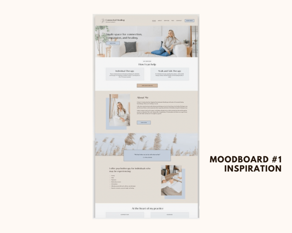
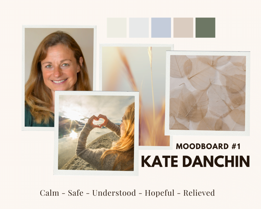
We browsed through Pinterest together for inspiration and she found a site she absolutely loved so we used that as a starting point. I created 3 mood boards for her to choose from. Then we worked together on the content and flow of information needed.


Her old site had got cluttered and messy so I helped her to streamline the content to just what was needed, nothing else.
We chose a series of images that went with the new branding colours that were very calm and neutral – making sure there were no body image photos that would be in anyway triggering.
Kate’s Must Haves Were:
– A real sense that they’ve found their safe place and the person they can trust to finally help them.
– Professional expert but kind, trustworthy and approachable.
– Easy to navigate.
– Whatsapp.
– Shadow boxes.
– Uncluttered layout.
– Free audios and FAQ’S.
– Plenty of white space.
– Mot too ‘bold’, too fussy OR too cluttered.
– No strong colours – no reds and oranges.
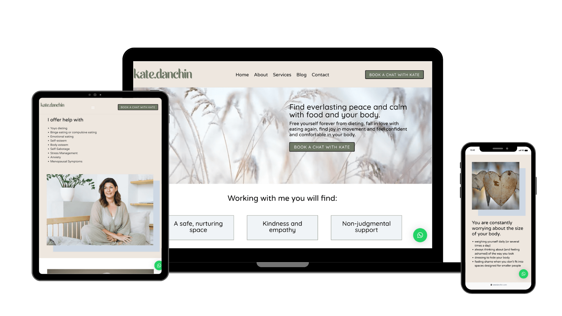
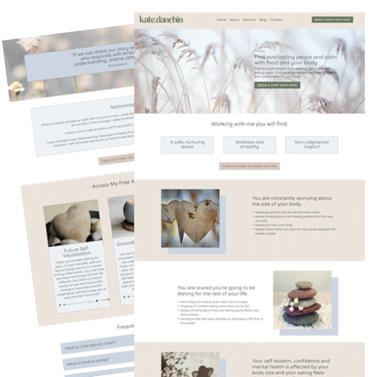
Here’s Kate finished design for her beautiful and strategic new website:

I LOVED working with Kate on her new site and I’m so proud of her glowing review 🌟🌟🌟🌟🌟
“Huge thanks to Mel for creating my gorgeous new website – and for making the whole process so much easier than I ever thought it could be. Anything techy makes me quite anxious, but Mel has the patience of a saint and ‘held my hand’ through the two week design/build. She completely understood my vision and created a website that is not only beautiful to look at, highly intuitive and easy to navigate, but also reflects the values and ethos of my business. Five star service from start to finish!”
Kate Danchin (https://katedanchin.com).


