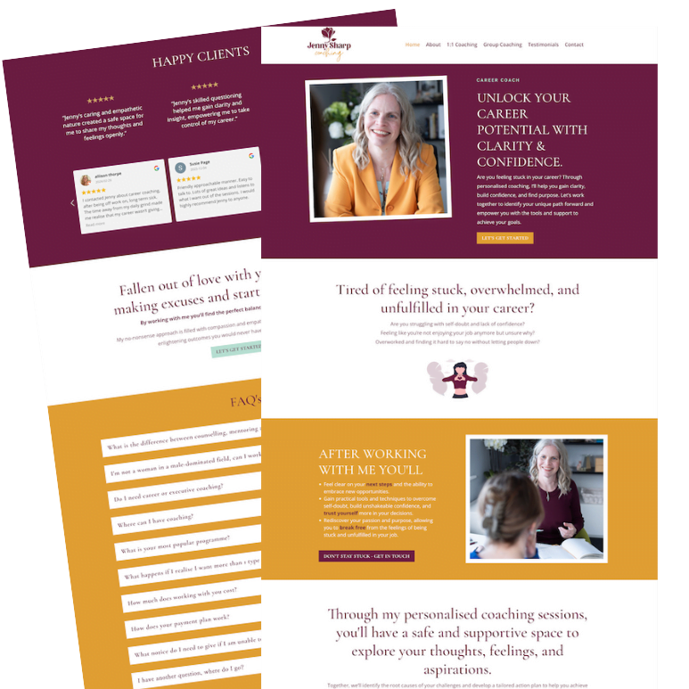
When I’m designing websites, one of the first things I think about, is how my clients want their clients to feel when they land on her website.
In the case of my lovely client Kate, as a Grief Coach, she felt it was really important that her new microsite didn’t feel sad. Instead she wanted her clients to feel a sense of hope and optimism, at the same time as respecting them experiencing living with grief (in one or more of its many guises).
Feeling that ray of sunshine and hope which was so important, worked great with a lovely picture Kate already had of her sat in a yellow chair wearing a brightly coloured dress. I’m a great believer in working what we’ve already got, and, in this case, I think this image worked perfectly!
I also introduced some pattern (leaves/abstract shapes) as I wanted to represent change, transformation and moving forward and I’m really pleased with how it worked out. What do you think?
To find out more about my services or to book a free consultation please click on the button below.


